Wednesday, 16 July 2014
P2 - Front, Back, Side, 3/4
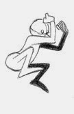
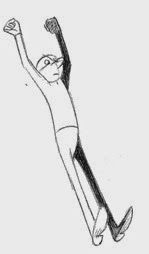
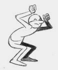
Creating this 360 I had to do it on art as I didn't have the Adobe software at home. While recreating my main character called George digitally, I had to look back and forth to the doodle sheet for reference. On the doodle sheet I already knew how George would look from 2/4 and 3/4 perspective because that was drawn from my initial design. The tricky part was figuring out how I would create George facing the front, backwards, and sidewards digitally. To help me I sketched the side and front and back view out so I could have something to look at.
Friday, 11 July 2014
P3 Storyboard
1- black screen
2- fades to sunlight (close)
3- cuts to a guy walking on roof top (mid shot)
4- he looks out towards the skyline (over the shoulder)
5- skyline
6- the guy looking down (point of view)
7- he leans forward a bit more then he should and starts getting of balanced (point of view)
8- he steps backs before he falls, then runs forward and jump (illusion you think his just died)
9- slides down on the roof top
10- the guy jumping from building to building (worm's-eye view)
11- when the guys about to land on the other building (point of view)
12- when his landed he runs off leaving you with a (worm's-eye view) of the building
13- he jumps again but doesn't stick the landing (birds-eye view)
14- his on the road and cracked his head blood is seeping out
15- rewinds to him doing the jump and fails again but is wearing safety garments e.g. helmet
16- in the exact same pose he lands in the first time, he gets up and runs off. leaving a red stain on the road
17- then cuts to him running across a building roof top with a helmet and ads name appearing on screen 'TESTING GRAVITY'
How I would like the text to look like^
P2 Shape doodle Sheet
What shapes was used:
Circle - boy's head
Square - penguin's head
Star - cat's head
Pentagon - the girls upper body
Wednesday, 9 July 2014
p.3. INITIAL PLANNING
1) For the animation project i'll be creating a Parkour rotoscope. instead of just making it a meaningless extreme sport thats been getting more notice well none in our most relevant trends. I wont to relate it to life by putting more depth into it and make it seem more like a journey by the music I'll be adding in.
2) The animated type of this sequence will be rotoscope with a bit of raw footage in between. I wanted to incorporate both types as it gives it an abstract feel but is also tangible concept that the viewers can relate to and fellow parkours that take interest in the animation. In current market I havent found an animation that incorporates what I want to do therefore i think it will be quite successful.
3) The genere of of style for the animate shows action but in an abstract way. the action is shown by the different stunts done in the animation however its done in rotoscope which is perceived as abstract cause its rarely been done.
4) Starts of with a guy walking, he doesn't know where to or where the journey will lead him. Finding his way through running, rolling, jumping, climbing, turns and twists. Gradually figuring out his way where he wants to go to, and eventually ending up at the train station leaving cambridge starting a new adventure.
p.3. Process and Equipment Set Up
P3 How far I am with my animation...
 |
So far I have the first 23 seconds of my animation in premier without the audio. However in Photoshop I have a remaining of 20 seconds of footage, which of 11 seconds are done and 9 seconds that incomplete- still needs a background to be put in and parts that need rotoscoping; therefore can not upload it to premier.
In audition where, I've made the first opening 16 seconds of audio which is going to act like a V.O.- its the intro from T.I.
Wednesday, 11 June 2014
P2. Animation Products Research
ADVERT-2013
Who directed it: Elliot Dear
What is the animation style: Traditional hand drawn 2D animation with stop frame model animation
Target audience: " John Lewis CEO, Andy Street, defines their customers as “Younger, more urban, more socially aware, they probably travel the world and have more liberal attitudes” The John Lewis target market is the upper, middle class, most likely in their 30s and 40s and they are able to spend on quality clothing, furnishings and technologies for the whole family."
What you like about it: I like the calmness about it that reflected in the the colour palette the tone of the music, and the message about togetherness at christmas.
TV SERISE-2003
Which company made it (who are they, what else have they made, where are they based): Walt Disney Company- also done the anima for hercules and aladdin. Based at Frank Wells building in the Walt Disney Studios
Who directed it: Chris Baile, McCorkle and Bob Schooley
What is the animation style: Hand drawn 50's style 2D animation
Target audience: Because of the shorter running time this keeps the audience engaged. I would say it can appeal more to the ages of 6-7 or 14-15
Purpose of the animation: To come up with a concept that was total orginal and not based on a movie or other tv shows. Also to focus in on the 50's/ 60's futuristic animation
What you like about it: It's exciting because its an ordinary teenager that you can relate too but she has a secreat identity
MUSIC-2009
Which company made it (who are they, what else have they made, where are they based): This was the first animation of Williams. Williams also is freelance.
Who directed it: Hype Williams
What is the animation style: this is a rotoscope 2D animation.
Target audience: 13+
Purpose of the animation: To set of a different atmosphere then his other videos.
What you like about it: it has that psychedelic feel to it from the 80's that puts you in a trance
WEB SERISE-2013
Who directed it: ShiftyLook
What is the animation style: 2D comic animation.
Target audience: I would say ages between 7-10+
Purpose of the animation: The customers they are wearing would cost a lot. and the concept just seems right to be a cortoon.
What you like about it: The boldness of the colour choices that makes it look interesting to watch.
SHORT-2014
Who directed it: Evan Viera
What is the animation style: Hand drawn 3D animation
Target audience: I would say, young teenager because he darker tones used as well, as understand whats happening.
Purpose of the animation: Would cost a lot of money to film this in real life and to build a tortes that big.
What you like about it: The mysterious mood it creates
FILM-1995
Which company made it (who are they, what else have they made, where are they based): Pitched the idea to disney but was rejected then started working for pixar and they approved idea. so over all based at pixar. They also have made 'A Bug's Life'.
Who directed it: John Lasseter
What is the animation style: computer animated
Target audience: for kids and parents who feel they still kids at heart
Purpose of the animation: Because its about toys coming to life it would be hard doing that with people ans you wont get the same effect. Also it was a big step in history for film as it was all computer animated.
What you like about it: its a classic, the idea of toys coming to life and what they would do makes it seem so realistic
P2 Animation Process Write-Up
Dot
Dot is the smallest animation process created as it was made using a microscope. The production of Dot was an actually advert for Nokia to demonstrate how good the camera is on that particular mopdel phone. They used all types of fabric and materials to create this magical background from ordinanry household items e.g. wool, wire, coins. For the character Dot in particularly they made her out of pvc and created about 50 sculptures of Dot, in different postions- as the sculptures was to small to be moulded or moved each limb into position.
Peppa Pig
The process used by the animators and creators of Pepper Pig was called quantel paint box. This process is pointed mainly towards television animation and also focuses on graphics within the animation. Peppa pig is a kids 2D hand drawn animation, they used the same drawing for every character of the pig family just varied in sizes, and all of the characters are very basic drawings for example the nose is on the side of the face rather than central, this is done to show sense of direction and to make it look like a kid drew it.
South Park:
South park was originally going to be done using cut out pieces of paper, but because this would take such a long period of time they decided to do it computer animated, it tales 5 days to make as the animators work night and day over these days, and on the 6th day its realised only giving them a day rest and they back at it again. They are the only series that dose this, South Park also incorporates politics so the concepts behind each episode is always relevant. It is aimed towards adults and also older teenagers as it has a lot of adult humour in and explict language.
P2. REGULATORY BODIES - BBFC
What is the role of the BBFC?
BBFC stands for British Board of Film Classification- it is not a government organisation, their founds come from the film industry and they are also responsible for national classification and censorship of film in the UK.
AGE RATING: There is a total of 7 age classifications in film
Legal Backing:
Human rights act 1988 - This act permits such restrictions of freedom of expression as are
prescribed by the law, also protection of health and morals.
The licensing act 2003 - This act is for cinemas, and includes the condition requiring the admission if children (under 18) to any film to be restricted in accordance.
The video recordings act 1984 - This act is about the films with illegal drugs, and violent behaviours, protecting children and vulnerable people being influenced.
The sexual offences act 2003 - This to show that it is illegal to expose oneself with intent to cause
alarm or distress, consent on filming sexual gratification.
Case Study for Coraline:
"Coraline, a feisty young girl whose busy parents often leave
her on her own. One day, whilst exploring her new house, she finds a door that takes her to another world, an alternative universe where she lives with her ‘Other Mother’ and ‘Other Father’. These ‘Other’ parents seem perfect – they cook delicious food and lavish attention on ‘their’ daughter, and yet they are also slightly sinister with their buttons for eyes and desire to keep Coraline with them."
The BBFC rated Coraline as a PG, shockingly this is because children's films are actually aloud to show some content of horror. However they have to meet the criteria of a frightening sequences; which are not prolonged or intense.
"Children sometimes enjoy the excitement of scary sequences, but, where films are targeted at a younger audience, classification decisions will have to look for factors like taking the frequency, length and imagery of horro scenes into consideration as well, as horror effects: e.g. music and sound, and whether there is positive reassuring end"
The film is considered to contain a lot of 'mitigating factors' which lesson the intensity of frightening scenes, these included key features like, comedy, playful music. When making a horro film that can be viewd by jonuors its important to have the 'rollercoaster' effect. Also the reassurance of a happy ending which tends to make the film to be a PG.
Monday, 9 June 2014
P2. REPRESENTATION AND ETHICS IN CARTOONS
Why does the writer of the article believe Rio 2 is problematic in terms of its representations?
although they did have a conservation-minded theme and mixed cast of White, Latin, American and African-American voice actors.
although they did have a conservation-minded theme and mixed cast of White, Latin, American and African-American voice actors.
What are PEPs and why are they an issue for racial representation?
PEP's stand for: Problem Context, Entertainment Context and Performance Contexts, these portray the racial stereotyping in animation. The idea of PEP's, is ethnically backgrounds like black people and other genotypes have to be associated with certain circumstances. common indicators to show racial features are grouped: exoticism villainy jocularity and athleticism are the most obvious stereotypes.
PEP's stand for: Problem Context, Entertainment Context and Performance Contexts, these portray the racial stereotyping in animation. The idea of PEP's, is ethnically backgrounds like black people and other genotypes have to be associated with certain circumstances. common indicators to show racial features are grouped: exoticism villainy jocularity and athleticism are the most obvious stereotypes.
P.2 Target Audience
Name: Shanice , Tyrone
Age: 5-10
Average day: they go to school 8:50-3:00, then come home and play, after watch tv then do homework then go to bed
Hobbies and interests: tv, music, game consoles
Spending power: parents are their main spending power, thats also where they get pocket money.
Typical media consumption per day: Shanice mainly watchs more tv and plays on her tablet, as where Tyrone is more on playstation
The animation will appeal to them: its a 2D style of animation, themes is adventure, i think Tyrone will apear to more monty's character. i think Shanice will like oreo's character as hes cute and appeals more to female gender.
P3 Animation Planning
how im going to do this: im going to be rotoscoping the the guy that will be doing parkour, i'll be leaving the background as it is in the footage
Thursday, 1 May 2014
Jumping over the ball
Friday, 25 April 2014
Subscribe to:
Comments (Atom)


.png)


